Frosty Full Moon Fox
- Martin Truefitt-Baker, Art

- Feb 12
- 4 min read
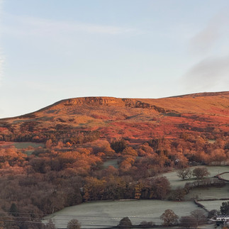
I started the design work for the new Frosty Full Moon Fox reduction linocut back in November 2025. There has been so much talk of 'supermoons'over the past year, although sometimes behind all of the hyperboli, they were a bit underwhelming. The one full moon I remember, around the time I started working out the image, had an orange glow around it, I think it was called a Wolf Moon. I'd also been doing some early morning walks up on the mountainside, where I sometimes see the big dog fox, so things started to fit together.
Originally I was going to have the trees full of the hawthorn berries that had been prolific last year as you can see from the drawing but they started to make everything much too fussy. I may use those images in another print or painting.
A few years ago I made a very successful print of a hare in a similar landscape (Frosty Hare). Like that design it is based on ovals and circles and has a more decorative, patterned feel than some of my other prints. The image was published as a commercial greetings card by Art Angels Publishing.


I had the fox facing the other way, so that the two prints/designs could work as a pair. The direction an animal is facing and moving in a design does make a difference to the way we see and understand it and it's relationship to the viewer though. We live in a 'left to right', right handed society. Have a look at this blog post from a few years ago - https://www.truefitt-baker.co.uk/post/left-to-right-well-hello-mr-fox-what-a-nice-surprise-to-see-you

It was colder before Christmas than after, It feels like it has rained every day since.


If you've read any of my previous blogs before, you'll know I like to start a print design by making an acrylic painting, usually just using tones of blue. This allows me to work out where the tones are in the composition, mostly unbothered by considerations of colour, although I usually have some ideas already worked out in my head.

This blue design is then my guide to the stages of cutting the lino. I work tonally and the first areas to be cut away from the lino are the white areas. That means that when I now print the lino onto paper with a very light toned colour the bits I've cut away will stay the white of the paper. As I keep saying (especially when I'm teaching the technique),this is a lot easier to understand, if you actually do it yourself, rather than having it explained to you.
Below you can see that I've scanned and the design, then used an inkjet printer to print out a reversed copy, to the size of my lino (26 x 26cm in this case).
you can see I've stuck the lino down to a registration board of MDF, using woodworking PVA, and I've stuck down some registration pins. I have attached registration tabs to the design, so that I can line it up again exactly onto the lino later in the process.
The image is transferred to the lino with some graphite paper. Then, as you an see, I like to go over the design with a black and a white ball point pen to fix the main parts of the design. The black ballpoint lines will stay visible through several rounds of cutting and printing but may at time need redrawing and adding to as they fade.

The white ballpoint shows the first areas of lino to be cut away.
Below is the lino with the white sections cut away and then it is rolled up with ink. There are actually three colours here of very similar very light tone. Two different grey/blues and an ochre.

This is the first (and lightest) layer printed. You can see that the ballpoint pen ink has slightly dissolved and printed in the oil based ink. I used to worry about this a lot and repeatedly scrup the lino to clean it off. It turns out the pen ink disappears after a few days, I'm not absolutely sure why.

So I printed out this first layer onto 50 pieces of paper. I was hoping for an edition of either 30 or 40. Some prints always go wrong, it's good to have some extras! Registering the paper in exactly the same place for every layer of printing is extremely important, so each piece of paper has tabs attached to one end that clip over the pins on the registration board.
Once the first layer of printing is complete, it's time to cut away more lino. This time its the very lightest sections of the design (the white has already been cut don't forget). Once that is finished, I roll up the lino in slightly darker tones than the first layer of printing, and print back over the first layer of ink, on every sheet of paper.
For this print there are 6 layers of printing. For each layer more lino is cut away and I use progressively darker ink. The last layer has two very dark shades of blue/grey.
This was layer three.
This was the sixth and final layer!
The prints were then left to dry for around ten days before being sorted and editioned. I've been fortunate enough to end up with an edition of 40 plus four proofs. Usually a larger proportion of prints fail due to getting grubby ink marks or the layers of printing not lining up exactly (misregistering).
Because of the printing technique I use, especially mixing and blending the ink on the lino, my prints alway end up with some variation. it used to worry me. Now it's something I embrace. Every one is slightly, everyone who owns one of my prints gets something unique.
Here are six of the individual prints from the edition of 40.


I get a professionally made photograph (a capture) of each design I make, as a record and in case they are going to be used commercially by publishers for cards, calendars, jigsaws or notebooks etc. It's important that the white areas print true and that the colours are accurately rendered.


I’m very happy to be the lucky owner of one of these prints! I really like the idea of working the design up in shades and tones of one colour (blue) so you don’t get hung up on colour too soon and you have a clearer guide of the cutting process when working from light to dark. I’m going to steal that!